Project Overview

This project was completed as part of my studies at St. Lawrence College in the User Experience Design program in my first semester. It was the first project I completed from research to a final working prototype.

I sought out to create a new online meal delivery service with a focus on Asian cuisine.  I felt that this was an underrepresented aspect of the online meal delivery landscape, with most services focusing on health-conscious meals, with less priority set to introducing customers to a variety of cuisines. Asian cuisine is unique and provides flavour profiles that can not be found anywhere else in the world. We wanted to bring these tastes to the world, all while teaching customers how to cook these meals for themselves.

Goals

Create a new online meal delivery service with a focus on Asian cuisine.

Research Phase

I felt that research for this project needed to focus on three aspects. Who would be using a service like this, what were other services like this doing for their product, and how could I brand this project to be uniquely Asian, in order for it to stand out more amongst the others.

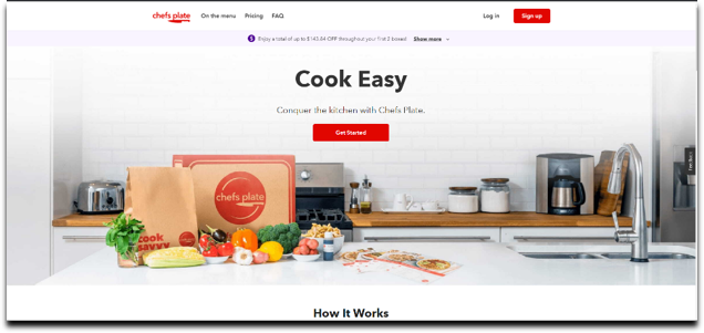
The first aspect I searched for was to compare various meal kit services that already existed and see how they designed their websites and their programs.

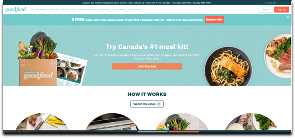
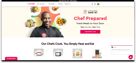
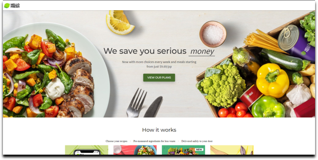
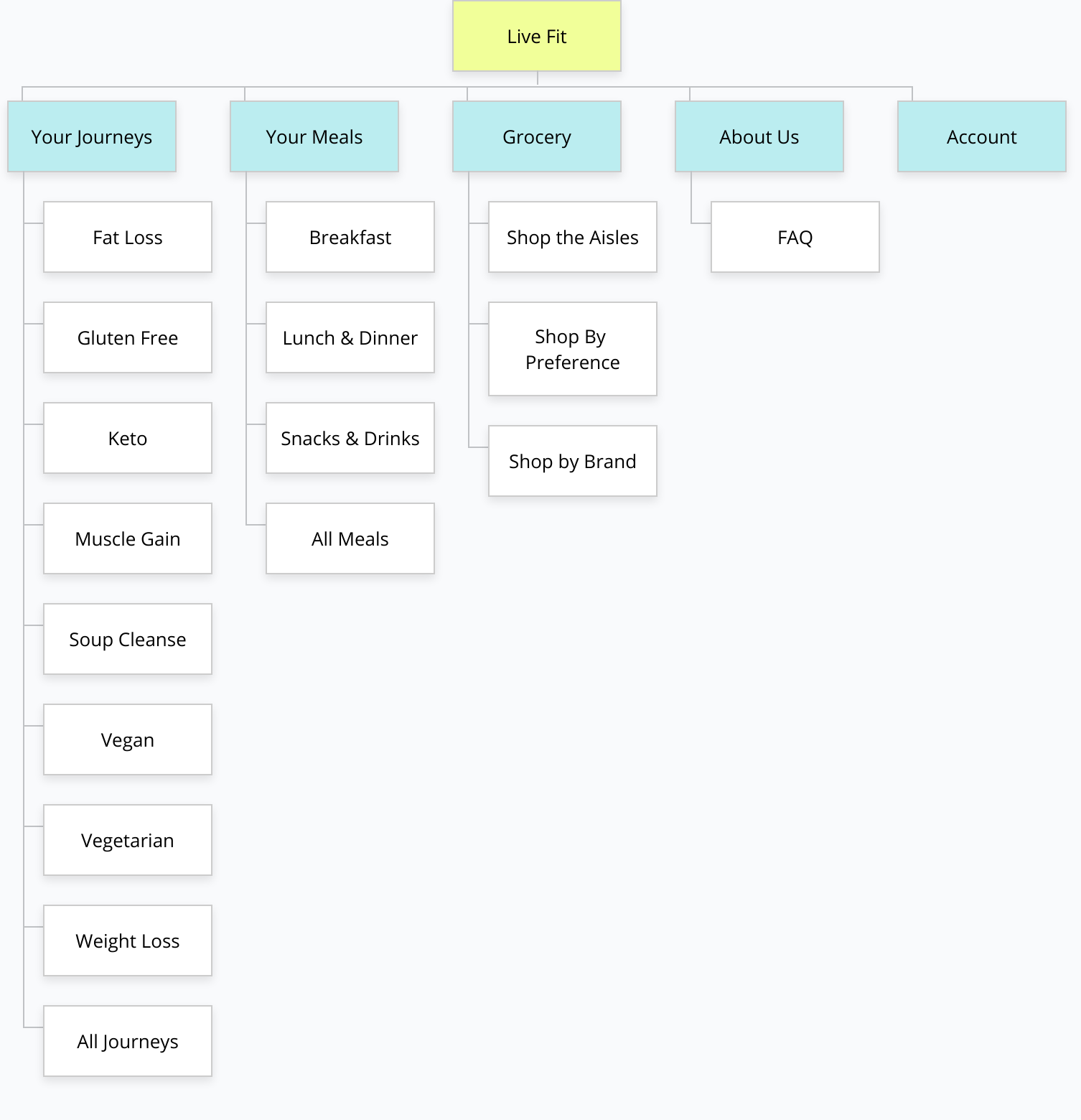
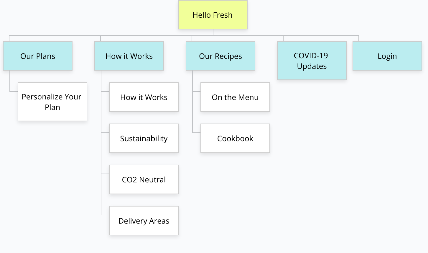
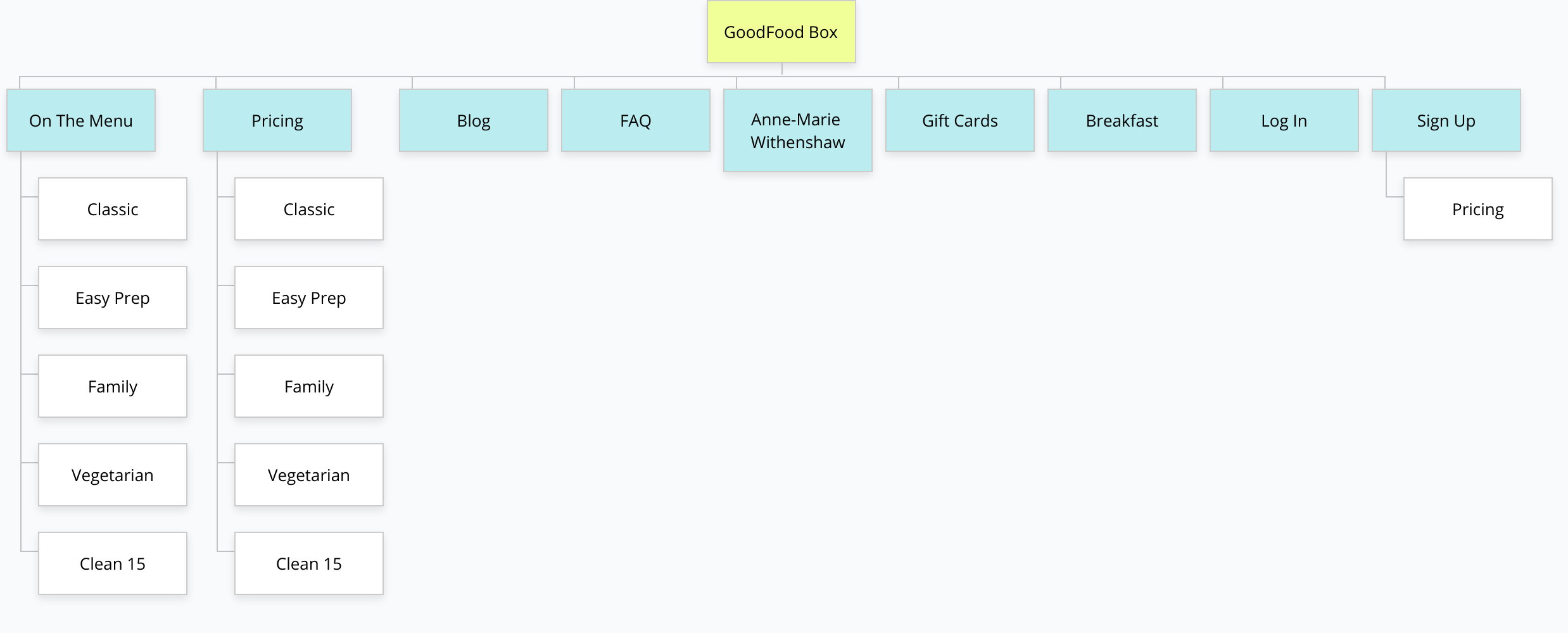
The four competitors I used were Chef’s Plate, Good Food Box, LiveFit, and Hello Fresh. These four were among the biggest in the field and were great examples of successful meal kit services.

My visual framework was also meant to draw the eye to the centre of the page, where the content related to that specific page was located, letting the global navigation bar act as a frame for the content, rather than distracting from it.

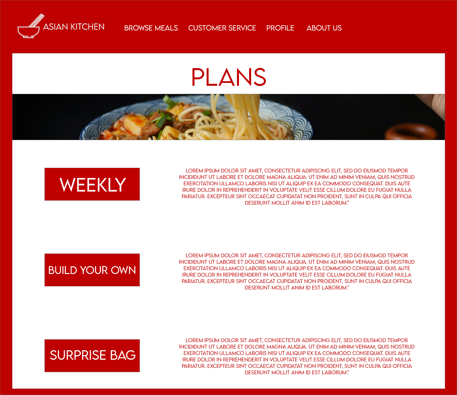
Through these examples, I was able to draw certain similarities. The competitors often utilized a plan system, where meals were differentiated into different brackets, such as “easy prep” or “family”.

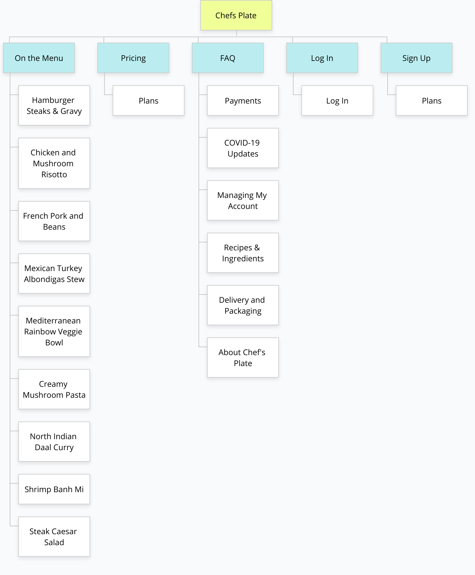
When looking at the various site maps for the competitors’ websites were all similar, having their meals together in one location, having a “mission” posted on their website, etc.

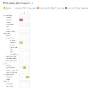
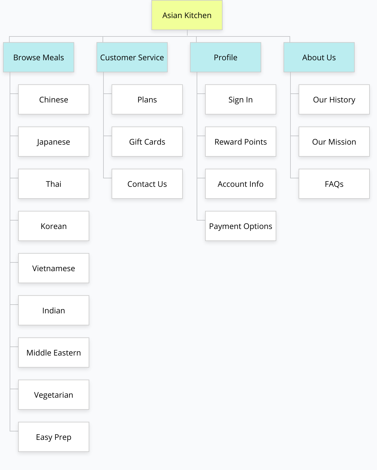
From this information, I started work on designing my own information architecture for Asian Kitchen. I completed both a card sorting test and a tree test to help guide my proposed sitemap.

With my research complete, I first created my proposed sitemap for the new Asian Kitchen website. By utilizing the information, I learned in my competitive analysis, coupled with the research testing I had done, I came up with a preliminary sitemap.

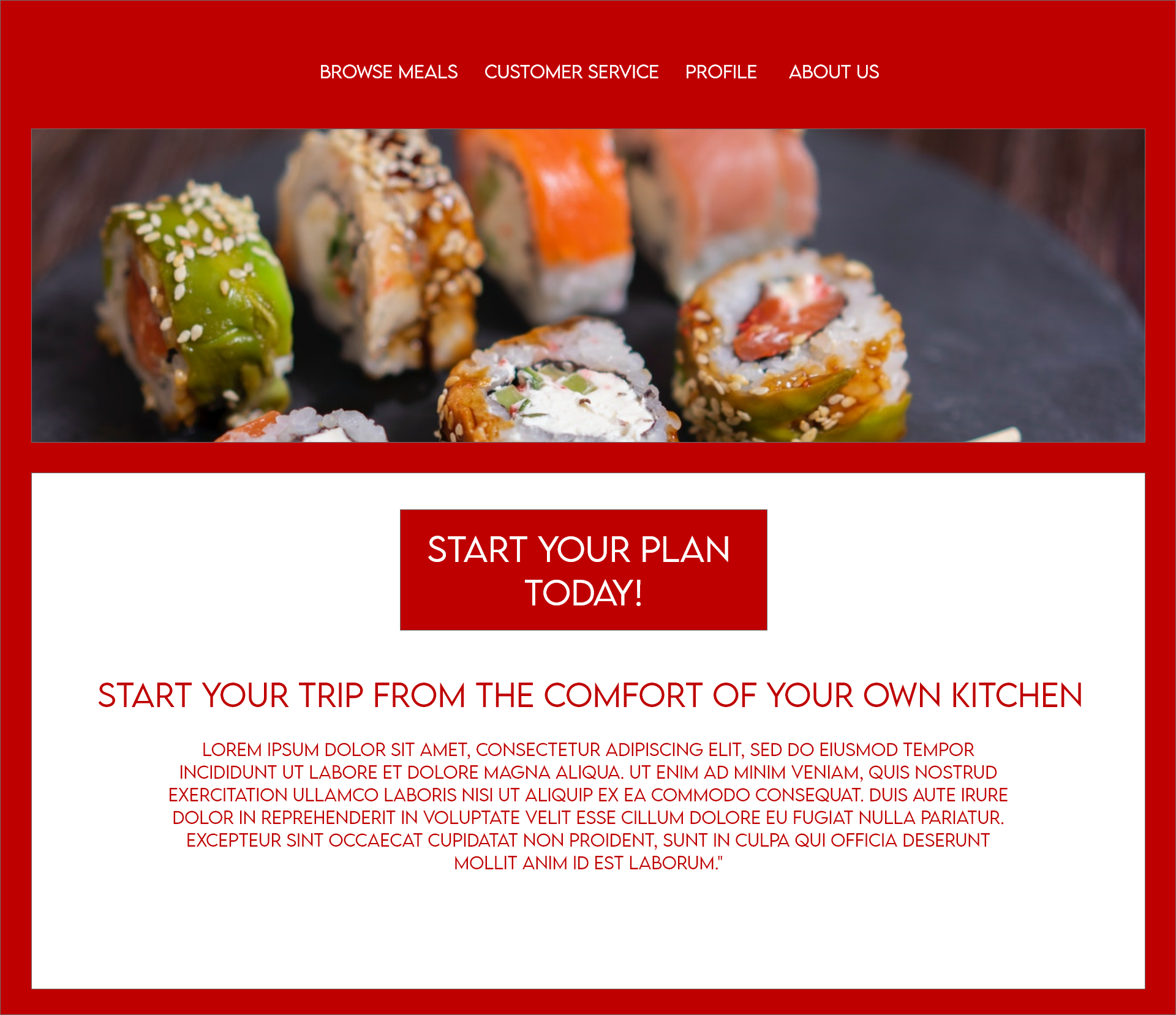
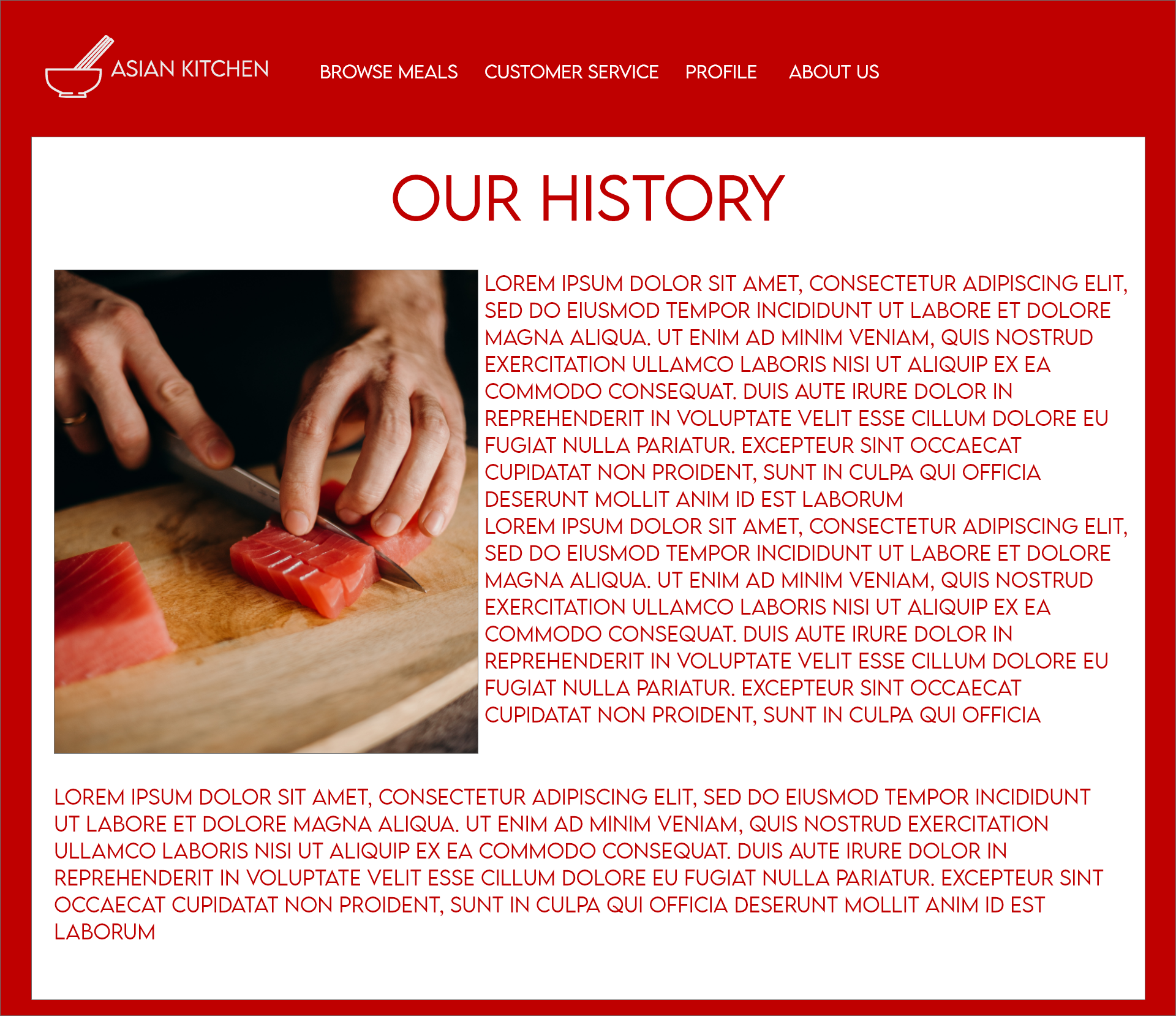
With the sitemap created, I next moved on to designing the visual aspect of the website. With my desire to utilize red as a primary colour, I designed my homepage around that idea.


Also, through my competitive analysis, I was aware that a global navigation system was a must-have, and I wanted drop-down menus to limit the space on the page needed to be devoted to the navigation system, with clear hover states to show what was currently highlighted, or selected on each page so there would be no confusion.

For the design of the website itself, I wanted to research positive colours in various Asian cultures. This way, the site would be paying respect to the cultures that were guiding the good dietary choices.


Design Phase

With this in mind, and my competitive analysis complete, it was time to move into the design phase.

With my desire to utilize red as a primary colour, I designed my homepage around that idea.

Also, through my competitive analysis, I was aware that a global navigation system was a must-have, and I wanted drop-down menus to limit the space on the page needed to be devoted to the navigation system, with clear hover states to show what was currently highlighted, or selected on each page so there would be no confusion.

My visual framework was also meant to draw the eye to the centre of the page, where the content related to that specific page was located, letting the global navigation bar act as a frame for the content, rather than distracting from it.

With this design in hand, the food was at the centre of the eye line upon loading the page, and that was important, as the food was what was going to sell the plan more than anything else.

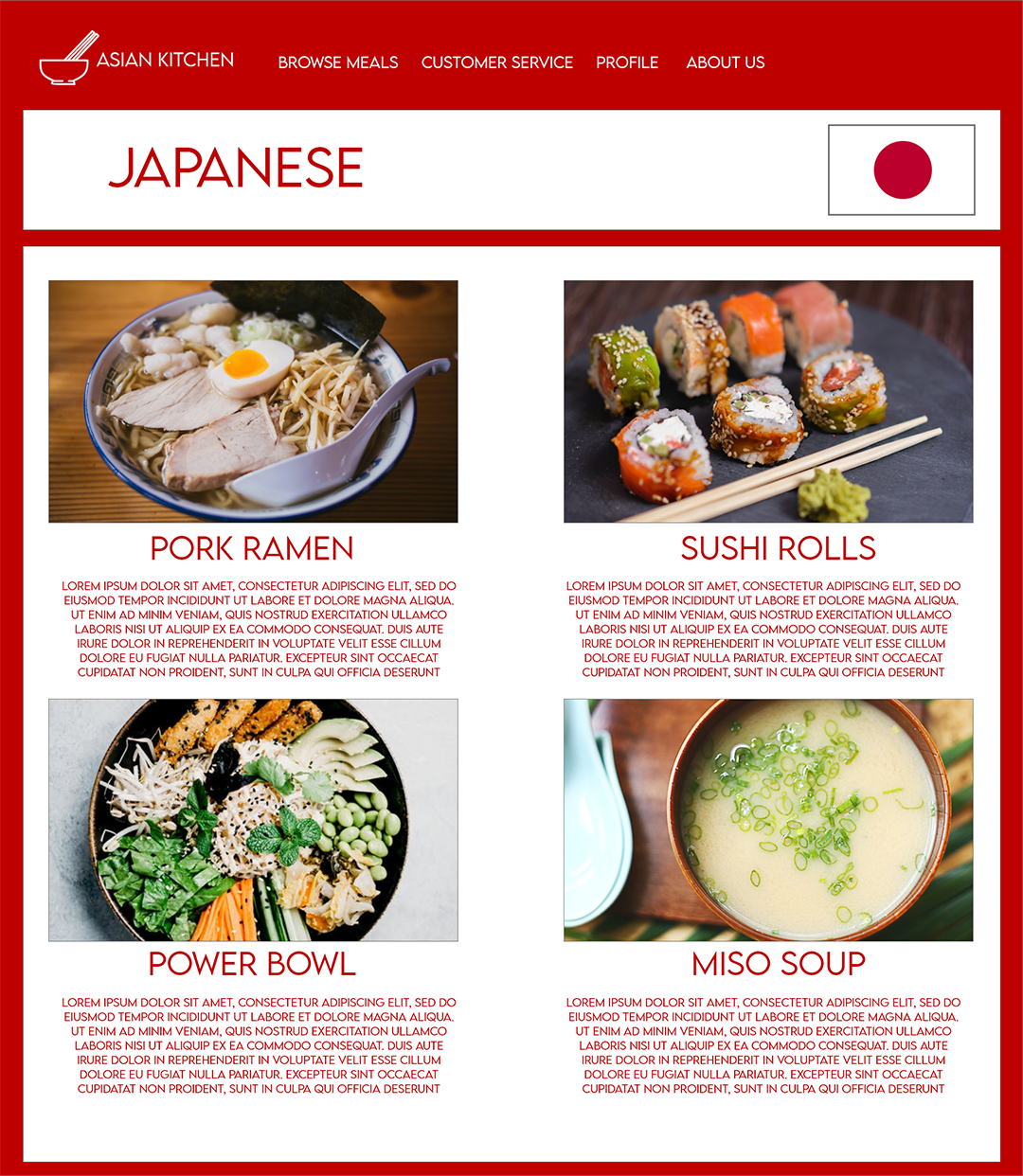
For the Food specific pages, I wanted to again primarily feature the food as the main selling point. Again, you can see that the food is the primary focus, with a simple bar along the top acting as a breadcrumb to inform the user where they are located with different food options and a brief description below.

After creating my prototype and testing it myself, I had three other people complete some simple tasks on the prototype. Since the prototype was not a complete version of the site, just selected pages, the tasks were fairly simple, and no users had any difficulty using the site, or understanding how the drop-down menus and hover states worked.
Conclusion

With my user testing complete, I felt confident in my design and its functionality, I submitted my design and my research and presented my work to the class as well.

Asian Kitchen