This project was completed as part of my studies at St. Lawrence College in the User Experience Design program in my second semester. It was the culminating assignment in my Information Architecture course.
Goals
Research and design a prototype of an app that would promote local businesses and attractions to tourists, similar to a brochure board that you would find in the lobby of a hotel. A secondary goal was to make the app easy for local businesses to add offers and advertise, so that small business could compete for business from tourists.
Research Phase
User Experience Chart
With this being a user-focused app, the primary focus of my research would be on the user experience. The first aspect I completed was a user experience chart to determine what the general user or business would utilize. On the business end, many options could be handled from a single menu, so the focus of the experience map was to expand the user experience.
Surveys
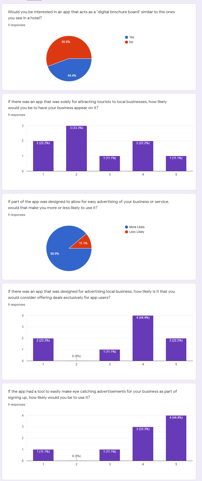
With my user experience chart in hand, it was time to move on to my surveys. I created two surveys, one for users of the app, and the other for small business owners. Through our small business survey, I found that some business owners were hesitant of the initial idea, but after learning of the additional features, such as the easy advertising and exclusive offers, 77% of respondents said they would be more likely to use the app. For my user survey, 94% of respondents said they would be open to utilizing an app that promoted local businesses, with only 1 respondent saying they would not use such an app. Prices, events, and value were the most important information to users when looking for a local business or event when visiting a new city.
The premise of exclusive offers for app users was said by 84% of respondents to be something that would make them more likely to use the app. When it came to showing results, I also asked whether users would prefer a list style or a grid style. The results for this were basically split down the middle, so I decided that for the app, I would offer a way to switch between the two.
Previous
Next
Site Mapping
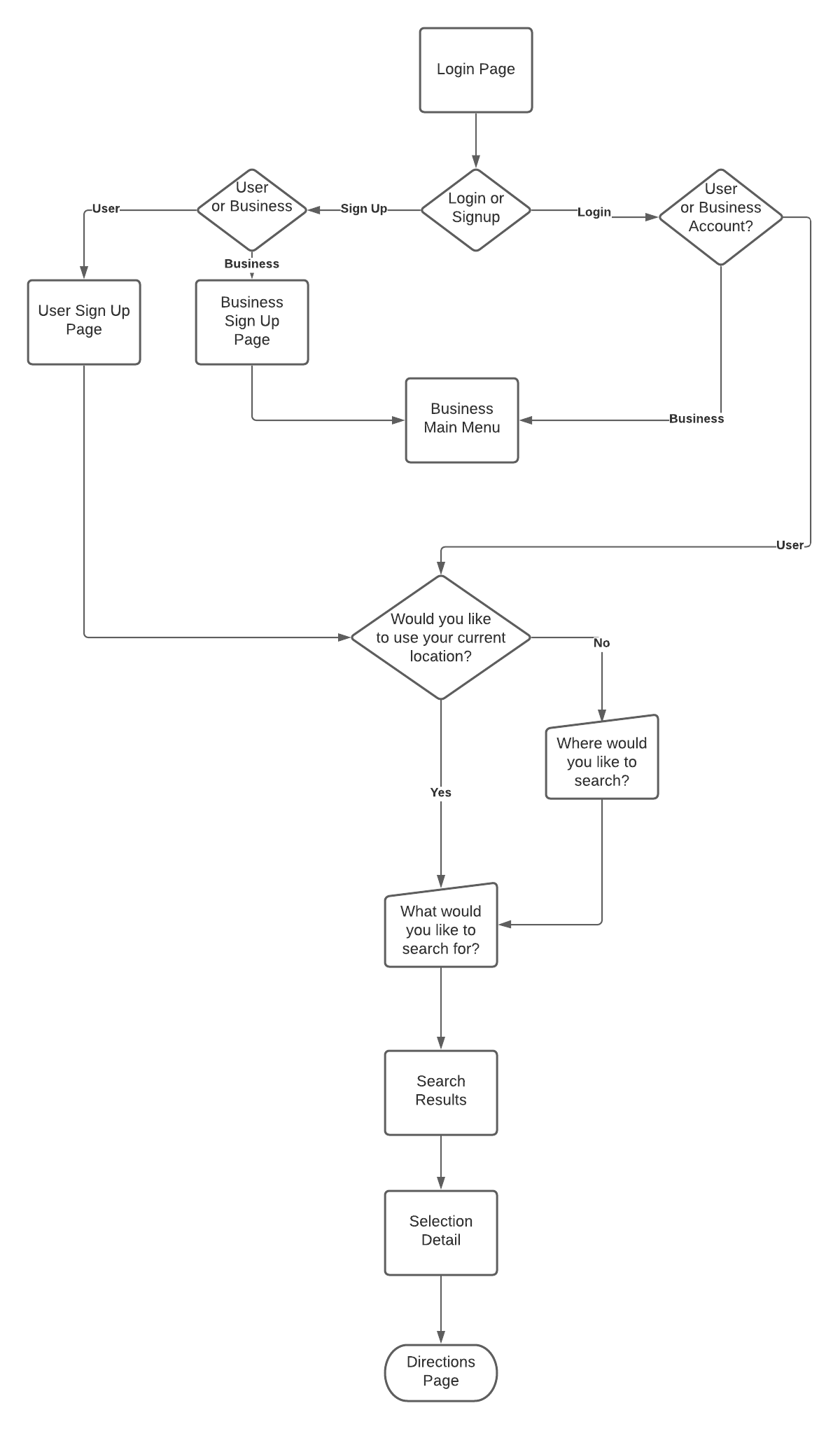
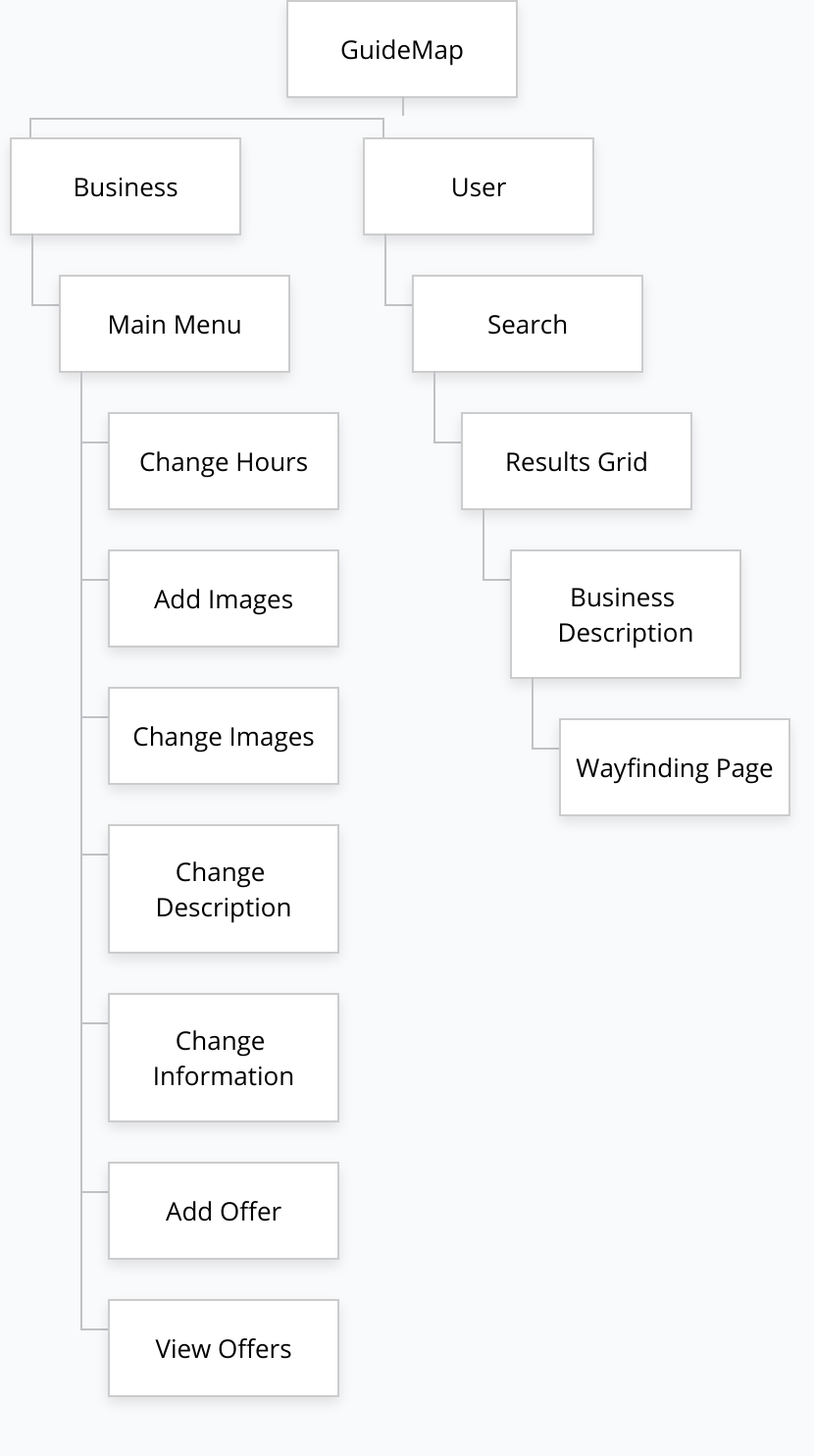
Using the research from my survey as well as the information I had gathered from my user experience map, I felt it was time to move on to the last aspect of my research, which was creating the sitemap for my proposed app. It was time to design the Information architecture of the new app. To do this I utilized a site map, which in contrast to the user experience map, the site map would largely be more focused on the business side of the app.
Design Phase
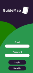
With the majority of the business aspects of the app originating from one head menu, this meant that the architecture would only be three levels deep. With my Sitemap in hand, I started on my app design. My goal was to make the app colourful and enticing, while also keeping this simple. This was purely a mobile app, so buttons would need to be large and clear. I had also decided that accounts would be tied to email accounts for simplicity and that whether an account was for a user or a business would be tied to the email. Again, this was done to make the process as simple for users as possible. With this design in mind, I created my prototype design to look like the following image.
The initial home page has a bright green section to draw your eyes with the darker purple meant to act as a background colour. When you click to login in, you get a bright, inviting. From here we are taken to our first choice.
Previous
Next
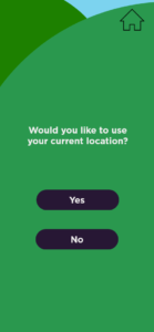
With this option, we can allow users to investigate the local businesses of a city they would be traveling to before they actually arrive in the city. In the final app, they would be able to type in the full address of where they would be staying to get the closest to their accommodations. For purposes of this prototype, it just shows the city.
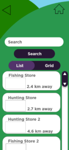
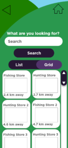
Once the user has chosen their city or allows the app to use their current location they are taken to the search page, where they can search for interests and receive the closest stores and events that relate to their search. From this search, they can have their information provided to them either as a list or in grid form.
Previous
Next
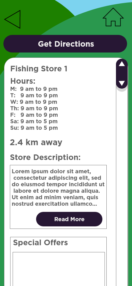
With an easy-to-use toggle to switch between the two. This way users can decide how they want to view the information. Once they select the business they are interested in, they are taken to a company detail page, where the business owner has filled in information about their hours, their business, and offers that are available for app users
At the top, there is a large button to get directions, and this will take you to the wayfinding function of the app. The wayfinding portion will utilize an already established mapping program, with options for walking directions, or directions by car, or by public transport. This way, the users will have options on how they would like to get to their destination. This concludes the functionality of the User side of the app.
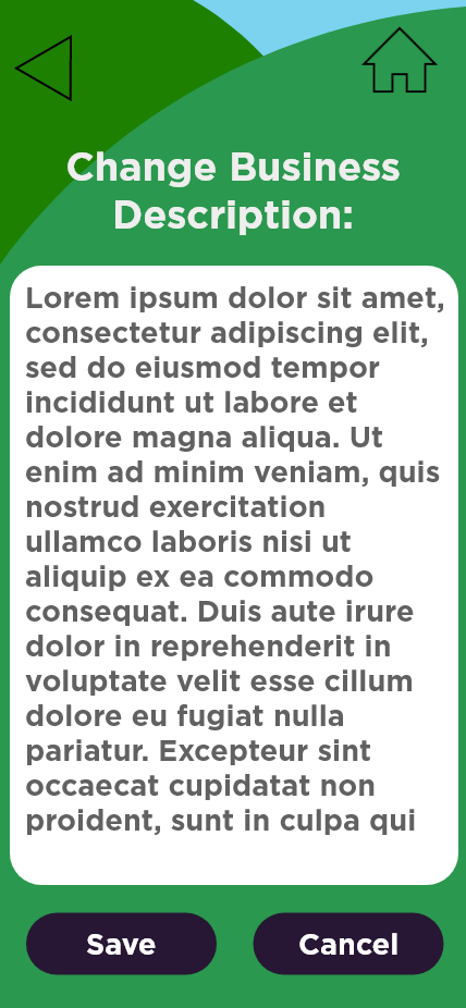
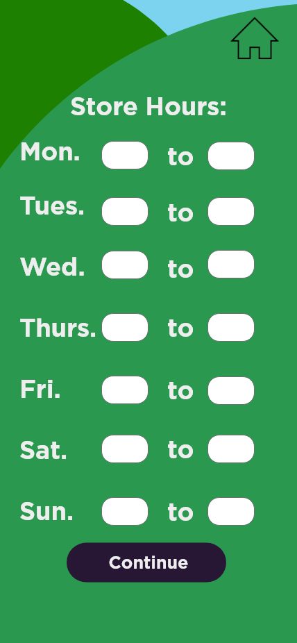
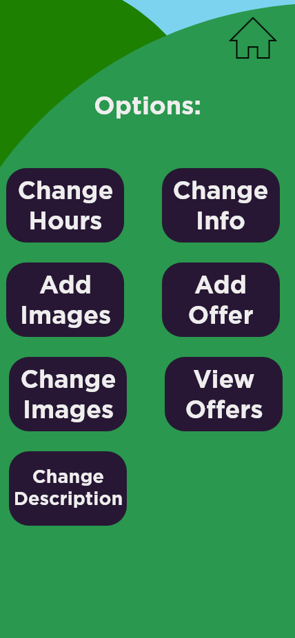
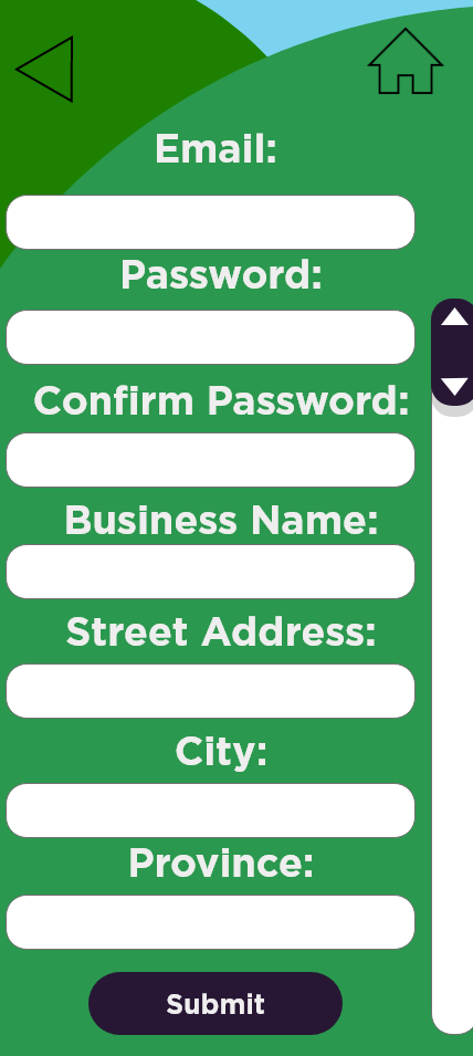
The side of the app for business owners shares the same login screen. When the user enters an email address and password for a business account, the page they are taken to provides them with options to update business information.
From here they can change how their business appears on the app, add or change pictures, add or change offers. Each of these options has its own pages.
My goal here was to create one page where the business owner could easily update and add to their online presence from their phone. This would keep the app contained within itself and makes it a one-stop app.
Previous
Next
Usability Test Phase
With my design created and my prototype connected for functionality. I was ready to do my usability test.
I conducted my usability test and there was little confusion as to how the app worked and its ease of use was confirmed, with even the most difficult tasks being ranked a 6 on the ease of use scale, with 7 meaning extremely easy.
My testers had a few comments about the design of the project, mostly relating to the toggle between the list and grid portions of the search result page. As a result of this, I changed the two separate buttons into a toggle switch, which made it more clear as to which item was in use.
There were also some other minor visual tweaks, but overall, the usability testing was a success.
With my usability testing complete and my design functional. I felt confident in my prototype to submit it for my culminating project. I compiled my assets and research together and submitted the project.